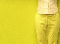
This is the first Rem Koolhaas building I have actually been in, if we don't count the Soho Prada store.(click here for my frien Architect Zhong Gui's review of the design of Soho Prada .)
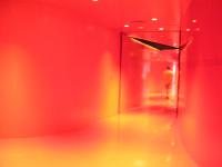
Color combination is very bold as you see the stairs of the library are actually matching my pants. So is the interior of elevators. The ground floor is a complete world of red, from top to bottom. You feel like walking into a human organ. Exposed concrete walls and silver or black ceilings or pipelines give that solid and raw touch. Overall , it is very futuristic, like the kind that you would have imagined in the 60s, Like when I saw Solaris by Tarkovski.
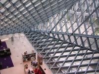
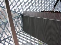
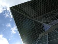
I don't really like the shape of the building from outside, but its glass ceiling and walls seem to have formed well in attracting light and capturing the delicate shift of lights and shades during the course of the day.
For a Saturday afternoon the library is well occupied and utilized. There are band playing, people reading or getting online and tourist like me visiting and taking snapshots.
I am curious to see how it is going to age--maybe it is good architecture, the building seems to be breathing and evolving, already.
No comments:
Post a Comment